Contour Lines or Shaded Relief: Choosing a Map View
Contour lines or shaded relief: choose the map view that makes a hillside, ridge or route easier to read, and know when to switch between them.
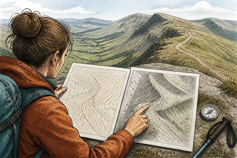
You are tracing a footpath on a paper map when the line bends across a hillside, but the ground around it still looks flat. Contour lines or shaded relief can make that terrain clearer in different ways: one encodes height in measured curves, while the other uses light and shadow to suggest the shape of slopes.
Neither view is a complete picture. Choose by the question you need the map to answer: how steep is this ground, where does a ridge run, or what shape will the land present from a particular direction?
Choose contour lines when height and steepness matter
Contour lines join places at the same elevation. On an ordinary topographic map, their spacing is the most direct visual clue to slope: lines close together indicate a sharper rise or descent, while lines farther apart indicate gentler ground. The printed contour interval tells you how much elevation separates neighbouring lines; check the map legend before interpreting them.
This view suits route planning, comparing alternative paths, and reading the shape of a hillside without relying on a particular light direction. A contour line that bends into a V-shaped pattern across a stream valley can help you recognise the valley’s course; a rounded cluster of closed lines may indicate a summit. Look at the surrounding lines rather than treating one curve as a complete landform.
Contour lines are especially useful when you need to compare slopes on opposite sides of a ridge. Their spacing remains meaningful regardless of whether the map is displayed with north at the top, rotated to match your direction of travel, or printed in monochrome.
Choose shaded relief when you need the land to read at a glance
Shaded relief, also called hillshade, models how a surface might look if lit from a chosen direction. Ridges cast into light and shadow, and hollows appear darker or lighter according to that illumination. The result can make a broad landform easier to recognise than a dense pattern of curves, particularly at a small screen size.
Use it to get a quick sense of a mountain chain, a dissected plateau, or the folds of a wide upland. It can help you see which slopes face towards or away from the assumed light source and where a ridge separates neighbouring valleys. A relief layer beneath roads, paths or place labels can also give context without requiring you to interpret every contour.
Shading is a visual cue, not an elevation measurement. A dark patch does not, by itself, tell you how high or steep the ground is. The effect can also be misleading if the assumed light direction makes a valley seem like a ridge, so compare the image with contours when the landform’s identity matters.
Match the map view to your task
- You are judging a climb or descent: start with contours and read their spacing along the route. Shaded relief can help you picture the slope, but it cannot replace the map’s elevation information.
- You are trying to recognise a ridge or basin: begin with shaded relief for the overall form, then use contours to confirm how the ground rises and falls.
- You are comparing two possible routes: use contours to inspect the changes in slope along each option. A shaded view may clarify the surrounding terrain, but keep the route line and map scale visible.
- You are reading a map on a small phone screen: try shaded relief if closely packed contours obscure paths or labels. If the display hides fine terrain detail, switch back to contours or zoom in.
- You are studying a familiar landscape from an unusual direction: use contours as your anchor, then check whether shaded relief changes the apparent shape when its illumination changes.
Say you are choosing between two footpaths that cross the same upland shoulder. One contour view shows a tight cluster of lines beside the first route and wider spacing beside the second; you would inspect the gentler-looking option more closely, then check the shaded relief to see how each path sits against the ridge. That combination gives you a clearer terrain picture without treating the shading as a measurement.
Read both views without mistaking appearance for evidence
Contour and relief layers work best as complementary views, not rival versions of the same information. Start with whichever one makes your immediate question easiest to answer, then switch or overlay the other if uncertainty remains. On a digital map, look for a layer control, opacity slider or hillshade setting. On paper, compare a topographic sheet with a separate relief map of the same area.
Keep the map legend and scale in view. Contours may be omitted, simplified or spaced differently between maps, while shading depends on the surface data and illumination chosen by the map maker. For a practical reading, check whether paths, watercourses and height labels are clear enough to connect the visual shape to named features.
Seasonal ground conditions are another matter: a shaded slope does not show whether a path is muddy, snow-covered or exposed to wind. Use a current local map or trail information for route conditions, and treat terrain views as a way to understand land shape rather than a report on what is happening on the ground.
Which map view answers your question?
Do contour lines show exact height?
They show elevation through lines of equal height, interpreted using the map’s contour interval and any labelled contours. A line between labelled elevations does not identify its value unless you count the intervals from a known line.
Can shaded relief tell me how steep a slope is?
It can make slope direction and broad shape easier to see, but its brightness is not a dependable measure of steepness. Use contour spacing and the map’s elevation information when comparing gradients.
Which view is better for finding a ridge?
Shaded relief often makes a ridge stand out quickly against adjacent slopes. Check the contour pattern as well to follow the ridge’s shape and distinguish it from a shadowed valley.
Should I use both layers at once?
Use both if their lines and shading remain legible together; otherwise, switch between them. A cluttered overlay can make paths and labels harder to follow than either view on its own.
For a quick decision, let the question lead: choose contour lines for elevation and slope comparisons, and shaded relief for an immediate impression of land shape. When a route or landform is difficult to read, compare both views and give the contours the final say on height.